We are still using Firefox 2.0 organizationally and it's very stable. We still have some sites that are not certified for 3.X, which I am monitoring closely. Like any forward thinking Admin, I have been running 3.0 and the 3.1 betas. I have found them to render faster, and they seem to scroll faster; however it seems to have come at great expense. CPU and memory usage is substantially higher. Can anyone else confirm this? I remember there was great debate concerning file handles and sqlite databases. Are these issues resolved? Right now, Firefox seems like it will be hard for me to scale to hundreds of people.
Here is a snapshot of my session on the server, with moderate usage for a few hours:
Monday, December 22, 2008
Thursday, December 18, 2008
Webcals, Summit & Remote Evolution
Things around here have been busy. I have been QAing and testing Evolution 2.24 and its interaction with Groupwise heavily. We are nearly to a milestone where I can increase the pilot/beta and add more people. I also have been installing a MoinMoin Wiki instance for use by City employees. Right now IT is testing it and trying to create some work flow suggestions, and it looks excellent. I will be devoting an entire blog entry to our goals and ideas.
Intranet Webcals
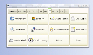
Our internal use of Webcal files has exploded over the last few years, so I have been writing a new GUI to make it easier for users to add sources to Evolution. We have a lot of information stored in databases that is appropriate for people to view on their calendars. Examples of this are employee birthdays, hire dates, anniversaries and so on. So we create .ics files of this type of information and drop it into an internal web server. That makes them available for all employees. Evolution has the ability to add webcals from the command line, so the GUI passes the webcal:// on the command line and it appears right inside their running Evolution session. All they have to do is pick a calendar color. The current state of the GUI is below:
Summit 2009
I have gotten approval to announce the availability of our facility to conduct the 2009 Summit on our premises if there is interest. I know that Boston is the tradition, so I'm just making a humble offer that it can be held at our location if you wish. We have a building that is used for training and emergency operations, and we could conduct the hacking in that facility. The one thing that we could offer is real GNOME users for focus groups and study of new features. We are a short drive from the Tampa (TPA) airport on the Gulf of Mexico. Hit me up on the IRC if this seems like a fit for the community.
Remote Evolution & Miguel
Miguel posted a blog about wanting to gain access to his Evolution while traveling. That exact product existed, was purchased and buried by SCO and now is owned by Sun. Tarantella let us run Xwindows applications 10 years ago, and was one of those great ideas that came out at the wrong time. During that period, people were still excited about client/server computing and how many Ghz you had at your desktop to care about centralizing applications. We ran Tarantella on SCO and Linux and it worked *great* for us. All you did was lay it down in your Apache web server, and point it to your applications and they immediately worked in a browser. In the pre-Evolution-1.0 days I even ran Evolution in this manner. You would log in from any browser, and it started a Java applet, and you would see the gray/white X checker boxes for a split second and your X application would immediately open. No plugins to add to the browser, no client side software. I found this old picture describing how it worked. It's too bad these types of products haven't become more commonplace.
Monday, December 01, 2008
Tuesday, November 25, 2008
Evolution, OpenOffice 3 And Screen Dumps
I have been busy the last few weeks QAing software for deployment. OpenOffice 3.0 is running well, and has been pushed to our beta testers and they are pleased with how it works. One interesting development in regards to OpenOffice is how much the native Mac port is helping with user perceptions. Even though we don't run it here, an ever increasing number of people are buying OS X computers for their homes. They *love* how well the Mac port turned out and use if for their personal use. This is leading to greater acceptance at the City.
OpenOffice 3.0 goes live on Monday December 1st for our 700+ employees. I wanted a greater level of notification of new features, so I wrote a quick little dialog that opens once immediately before going into the license acceptance screen in OpenOffice (please, please allow admins to accept this license once in the future!). Here is what they will see:
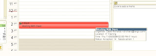
Prepping Evolution 2.24 for deployment has been taking a good amount of time. Much of the "under the hood" code had changed in the last few years, and needed to be tested with the Groupwise backend. My friends in India are knocking out the issues and we are getting closer to reaching a milestone, and working in some much needed calendaring features. Milan cooked up a patch that displays the status of whether people have accepted their meeting requests (shot below) in the tooltip. This allows you to hover your mouse and see if people have declined.
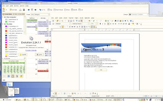
So here is a shot of how Evolution 2.24 and OpenOffice 3.0 will look to the users, coming along very nicely.
Some have been interested in modifications that I make to the standard GNOME desktop. By default, (print) does a screen dump of the whole screen. (alt)(print) allows you to dump just one window. Two other things were happening and required a third option. 1) Some users wanted to be able to take shots of pulldown menus actively in use; 2) Some MS Windows applications running over Citrix/RDP have a canvas which shifts when focus is removed from the window via mouse click or keystroke. So, I globally added (ctrl)(print) which gives them a notify-send popup and alerts them that a screenshot will occur in 10 seconds. They can then position their software was desired and the snapshot is taken.
I have been working on a Wiki/document management/GNOME integration project and will blog about it soon. It's still being discussed and designed at a very initial level, but coming along nicely.
Tuesday, November 04, 2008
Evolution Testing + Compiz Cube Caps
This last week, I have been busy doing QA work on Evolution 2.24 with the Groupwise backend and submitting all of the issues to Novell. Sankar shipped me a patch late yesterday that allows me to widen my beta testing to more employees. Looks like we will be merging in a lot more calendar functionality which will be greatly appreciated by our users. Each upgrade gets us closer and closer to feature parity to the Groupwise client, which is excellent.
When I was teaching Compiz classes to other employees it was an often requested feature to put other images on th top of the cube caps. This is another example of something too hard for most users with the ccsm interface because it assumes:
- They know what size to create the image
- They know what file format to create, and don't just change the file extension
- They know how to work with transparent layers in GIMP
- They know where to save the file.
- They know where to find the file later.
- They know how to give it permissions that other users can use as well
- They know not to delete it, because it's already been "attached" (ala email).
I went through and generated 10 pre-defined caps with color matched sky domes and then created a very simple custom GUI. All they have to do is push a button and click [ OK] and everything is taken care of for them. 4 of our departments have their logos, and it's little things like this that generate excitement about using Linux.
Wednesday, October 15, 2008
Evolution Canvas Love?
In the last few weeks major projects that were consuming time have been completed. The new desktop servers have gone live and it's time to move on other projects. OpenOffice 3.0 is out and it has been installed on our server for beta testing by some of our power users. There are tons of features that need to be QA'd before it is moved "live" and that's going to take several weeks.
I also have started doing a lot of work on testing modern Evolution with the GroupWise backend. Version 2.6 (+ backports) is currently in production on SLED 10 and now it's time to upgrade. Lots of the internals of the new version have changed, and I have started putting in bug reports.
Features are an important part of Evolution and the users will be happy with what is coming. However, I can't help but think we can improve the look of the calendar. A new look widget was added a while back, but I'd love to push live something with a bit more of a dramatic look. Yes, part of success of a project is bling in the right places. Unfortunately this type of hacking is beyond my skills.
Here is how Evolution currently looks when displaying the calendars of two users:
It's functional and works, but in my view is lacking the last little bling kick that provide user excitement. In reviewing other products, I found the screenshot below. If we could land something like this in Evolution, I know it would be received well.
Here is what I like about this look:
- Black/White colors for the calendar hash marks, very clean and paper like
- Glass like event UI makes it appear modern and it seems to have depth
- Overlapping colors (which probably should be an option) gives a visual cue of conflicts.
Here is a mockup:
Email is such a critical part of the desktop, and functional and UI improvements make my life so much easier. Chen, maybe this could be finished by the time I get up tomorrow? :)
Friday, October 10, 2008
Fun Time In Boston And Thanks
I just got back to Florida after spending a few days at the UI Hackfest in Boston. It was my pleasure to meet everyone and watch the process of open source software taking steps forward. I hope that my presentation was able to help with ideas and to point out improvement areas in the software and widgets.
It's completely amazing to me how much functionality we are running on Linux, and I'm looking forward to seeing what we can all do in the future.
Wednesday, September 17, 2008
Going To Boston UI Summit
After some logistical work with Federico and myself, we have coordinated me going to the Boston UI Summit. I'll be doing a presentation on October 7th concerning issues that I faced deploying GNOME and Linux in a Governmental agency and custom mods and UIs that I had to build. I also will be discussing the areas in which regular users struggle using computers.
I also hope to bring along one of our HP thin clients so that we can demo Compiz and GNOME running over remote display via a network.
If anyone is attending and has topics that you want me to discuss, feel free to respond to this blog. At a minimum walk up and introduce yourself. I don't often get a chance to go to these types of events, and I'm looking forward to it.
Monday, September 08, 2008
Document Centric Desktop
I have been thinking more lately about Federicos "Document Centric" presentation. Document and file management is by far the hardest thing for users to understand. I kind of feel that considering it's 2008, there is very little hope of that situation improving. So I was checking his mockups on ideas for helping people find their documents. Users tend to cringe on learning something new, or having to go into a new program.
So as a rough proof of concept I wrote a ksh script to convert $HOME/.recently-used documents generated by OpenOffice into a .ics file and then allowed Evolution to load the results. I kind of like all date related items being stored in the same software. Email is open all day, which makes it immediately useful. No clickable links obviously, but at least points them in the right direction. I submitted it to the cron for a few power users to see how it runs. I threw it on an internal webserver and they are now using webcal:// to view the data.
file://, easy to see it's a file. Mouse-over tooltip provides full file name
We know the time of the file touch as well, so we can put it inside a 1 hour window.
Here is the WFM code, no attempt was made to make it pretty and useful to other people:
Edit: The paste of the code failed, some of the tags were picked up as HTML. So created a link
Here is the code
Wednesday, July 30, 2008
OpenOffice Writer Objectives
I was asked to publish the objectives of our OpenOffice Writer test. The goal of this testing is to increase skills, and will also be used with new hires. Robust word processing skills are far more rare than many of you probably perceive. We are seeing that most people still use computer software as you would a typewriter.
The objectives:
Level 1
Level 1 File Management
-Create, open, name, and save files.
-Navigate a file structure to a specific file or directory.
Level 1 Text Formatting
-Copy, cut, and paste text.
-Format text with font, font size, emphasis such as underline.
-Format text with foreground and background color attributes.
-Align and indent text using formatting techniques instead of spaces or tabs.
-Use spellchecking tools to identify and correct misspelled words.
Level 1 Graphics
-Add graphics to a document using the Gallery or by navigating to a graphics file.
-Position graphics within a document.
-Copy, cut, and paste graphics from one spot within a document to another.
-Resize graphics.
Level 1 Lists
-Apply automatic numbering and bullet formatting to text.
-Select a specific number format and bullet format for the list.
-Indent list items to create subitems.
Level 1 Tables
-Create and delete tables.
-Create tables with or without specified attributes.
-Apply table formatting such as shading to existing tables.
-Add and remove rows and columns.
-Control table and column size.
Level 1 Page Setup
-Insert automatic data fields.
-Set margins and page orientation.
-Insert page breaks.
-Add content and page numbers to headers and footers, and format the content.
-Format pages with borders and shading.
Level 1 Printing
-Print to default or another printer.
-Print specific pages.
-Create a PDF copy of a document.
Level 2
Level 2 Text Formatting
-Apply spacing between lines and above and below paragraphs.
-Modify text appearance and capitalization through formatting.
-Apply borders to paragraphs.
-Indent paragraphs using an exact amount, and indent the first line of the paragraph differently -than the rest of the paragraph.
-Apply specified tab stops.
-Uses special characters in text such as an accent or other symbol.
-Link text to open a web site or document.
-Copy existing formatting from one piece of text to another.
Level 2 Graphics
-Control how text and graphics are positioned in relationship to each other, such as wrapping.
-Resize graphics proportionately.
-Apply formatting such as a border to a graphic.
-Modify the picture using effects such as grayscale.
Level 2 Lists
-Specify different number and bullet formatting for different levels in a list.
-Change level for an item, to demote it or promote it in a list.
-Restart or continue numbering to split or join lists.
-Add an unnumbered paragraph within a list.
Level 2 Tables
-Align tables.
-Control column size using automatic formatting.
-Remove formatting from a table.
-Merge and split cells.
Level 2 Page Setup
-Apply columns.
-Apply background graphics to page formatting.
-Change page number type and specify which pages page numbers appear on.
Level 2 Printing
-Use page preview.
-Use OpenOffice features to email a document in its current form, Microsoft form, and PDF form.
-Print specified-only pages of a document to PDF.
-Print multiple pages on a sheet.
Tuesday, July 29, 2008
Have Your Ammo Ready With OpenOffice
I've blogged about it before; users have a deep emotional connection with Microsoft Office. I'm not talking about those of you that are super power users and make use of advanced features. I'm talking about regular clerical and office workers that are not creating documents much beyond set margins/bold this/italic/insert graphics and print. What we have found is that a lot of people really struggle with word processing, regardless if it's OpenOffice or Microsoft Office. The problem with deploying the former is that they are then able to "blame the tool", and as an IT member it's important to ensure that management knows the root of their complaints. The biggest comment that they make is "it takes 10 steps in OpenOffice to do what you can do in Office in 1 step". Of course, we all know that's absurd.
I have been working with Solveig Haugland for a number of months in coming up with a word processing test that follows closely the skills required for MS Office certification. A huge side benefit of creating this test is that we created a grid matrix on these features and counted steps in both products to complete the tasks. This type of grid can then be taken to management and you can show them that the 10-to-1 complaint that you hear is unfounded. The beauty of this plan is that going into the future, the more they complain the more management knows that they don't know MS Office either!
Here is a summary of the data.
No MS Office equivalent to OpenOffice feature: 36
Openoffice can be configured to work like MS Office: 3
OpenOffice has fewer steps than MS Office: 4
Identical language and steps in OpenOffice and MS Office: 68
Slightly different language, but same number of identical steps: 41
Different steps, but not more clicks: 15
and the big one:
More steps in OpenOffice vs MS Office: 3
This disproves the theory soundly that users are hindered by the steps in OpenOffice. If you aggregate the instances of OpenOffice being easier, you actually can build a case for OpenOffice being fewer clicks on commonly used features.
If your Governmental agency is struggling with funding, this is an excellent first step to take to reduce costs. It scales well on Linux and can be deployed to hundreds of people easily.
If you need training for your organization or would like to speak to Solveig about the test, feel free to contact her from her web site.
Thursday, July 24, 2008
#Performance
I am starting to get some numbers for those of you interested in GNOME performance, and for those that are considering deployments. Our GNOME server is up to 106 concurrent users. More and more people are coming over each day, and it's interesting to watch the server scale. We have two identical machines, each able to run the entire City. Our total user load should be around 300 concurrent when finished, split between the two servers.
Raw data:
- Looks like it took around 8GB to get 106 users logged in + OS
- Looks like we could get about 300-400 total on this machine without swapping.
- The parent dbus-daemon is the top process 99% of the time.
- The python process for avant-window-navigator is a steady chew on the server.
- 17 users disabled gnome-panel and enabled avant-window-navigator
- Total of all CPUs sits around 10-15% consistently.
- Server is 4 CPU, dual core, 3.66Ghz
- 74 of 106 logins enabled Compiz and 3D effects.
- 15 total users are using NX from low bandwidth remote sites (no 3D for them).
- I can't add .desktop files with this user load, it hammers the server too much
Anyway, things are running well and looking forward to project completion in 30 days.
Wednesday, July 23, 2008
Training Classes Continue, Cleanups
I have been busy working on the new desktop deployment. I have been training employees and granting permissions for those that will have USB and Sound/Video/Audio access. Those permissions are based on paperwork and signature from their Directors. When we discussed deploying sound to desktops, one of my concerns was employees streaming radio stations which consumes network both on our intranet and on our internet connection. It only took a few days and sure enough that has started. A quick message to those folks halted that practice. I put mplayer and gnome-mplayer into their own group and then set them to 770 so that a Firefox user with some skill won't be able to execute them, even if they find the binaries.
During the training, I found that my hastily designed zenity UIs for weather-wallpaper and xplanet were not robust enough. So today I whipped up a few screens with Glade that are far more user friendly. (shots below).
Monday, July 07, 2008
New Desktop Going Live
After over a year of work, terminal upgrades, patches and custom UI's we have locked in a date for the whole City to migrate to the new OpenSuse desktop. It's going to be really nice to finally complete this project. It will allow the user to fully utilize all of the features of the new thin clients. The go-live date is August 25th.
For the next 6 weeks, I will be offering training classes to City employees. The class will cover things that are very basic to us; logging in, finding software, creating shortcuts, customizing fonts/colors/themes/wallpapers and then logging off. By default, City users will not have Compiz enabled. I will also be offering some classes in how to use Compiz, which will allow them to enable 3D effects. I perceive that most users will want to use metacity, and just get in and do their work.
There was enough interest in using the avant-window-navigator that I created a small custom GUI for them to enable/disable that type of panel. (shot below).
If they have selected the second or third option, it automatically runs avant upon startup. When avant runs, I automatically force in few applets each time it's run, so if they accidentally delete a mission critical icon, it's back upon next login. I force in an icon to get to the "Application Browser", and also always force in the Calendar applet and Quit applet. I didn't feel comfortable completely deleting their regular gnome-panel, so I issue the following two commands when avant runs:
/opt/gnome/bin/gconftool-2 --type Boolean --set /apps/panel/toplevels/bottom_panel_screen0/enable_arrows True
/opt/gnome/bin/gconftool-2 --type Boolean --set /apps/panel/toplevels/bottom_panel_screen0/auto_hide True
This allows them to turn off avant and get their panel back. It does leave a few pixels visible on the bottom however. Not perfectly clean. I didn't see any gconf settings to completely hide, yet retain a panels attributes.
Here is how avant looks at a 45 degree, on our thin clients. It was very well received:
I also have been tinkering with the idea of creating "super themes" which configure GTK + Wallpaper + Compiz all at the same time. In the future, there probably should be a mechanism for GNOME users to pick up all of these settings with a single download and install. For fun, I created the theme below:
Up next for me is probably a 1 year R&D project to get "caught up" again. I'll be staging OpenSuse 11, testing the latest version of Compiz, experimenting with newer versions of Debian on the HP thin clients, upgrading the X version, and testing the proprietary ATI driver for performance. It never ends.
For the next 6 weeks, I will be offering training classes to City employees. The class will cover things that are very basic to us; logging in, finding software, creating shortcuts, customizing fonts/colors/themes/wallpapers and then logging off. By default, City users will not have Compiz enabled. I will also be offering some classes in how to use Compiz, which will allow them to enable 3D effects. I perceive that most users will want to use metacity, and just get in and do their work.
There was enough interest in using the avant-window-navigator that I created a small custom GUI for them to enable/disable that type of panel. (shot below).
If they have selected the second or third option, it automatically runs avant upon startup. When avant runs, I automatically force in few applets each time it's run, so if they accidentally delete a mission critical icon, it's back upon next login. I force in an icon to get to the "Application Browser", and also always force in the Calendar applet and Quit applet. I didn't feel comfortable completely deleting their regular gnome-panel, so I issue the following two commands when avant runs:
/opt/gnome/bin/gconftool-2 --type Boolean --set /apps/panel/toplevels/bottom_panel_screen0/enable_arrows True
/opt/gnome/bin/gconftool-2 --type Boolean --set /apps/panel/toplevels/bottom_panel_screen0/auto_hide True
This allows them to turn off avant and get their panel back. It does leave a few pixels visible on the bottom however. Not perfectly clean. I didn't see any gconf settings to completely hide, yet retain a panels attributes.
Here is how avant looks at a 45 degree, on our thin clients. It was very well received:
I also have been tinkering with the idea of creating "super themes" which configure GTK + Wallpaper + Compiz all at the same time. In the future, there probably should be a mechanism for GNOME users to pick up all of these settings with a single download and install. For fun, I created the theme below:
Up next for me is probably a 1 year R&D project to get "caught up" again. I'll be staging OpenSuse 11, testing the latest version of Compiz, experimenting with newer versions of Debian on the HP thin clients, upgrading the X version, and testing the proprietary ATI driver for performance. It never ends.
Friday, June 20, 2008
Main-Menu Changes For OpenSuse 11.1
I read with interest this page concerning ideas and changes for the main-menu (slab) in GNOME. I have about 100 people deployed on it right now, and another 650 going live in the next 30 days. It's been in use for a while now, so it was cool to see that the development team is noticing a lot of the same things that I have.
I'm putting my comments inline with the items listed on the development ideas page. Some of the changes are going to make things harder for us (and very possibly other enterprise users).
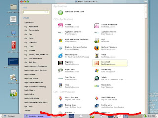
To start with, there is how our main-menu looks with all of our software loaded. We have a lot of departments each with their own software packages. I'm positive this is way more applications than is being tested; but very probably is the amount that most bigger deployments will use.
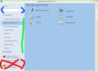
In 1024x768 users are unable to get to the window manager handles on the bottom (marked in Red). The "Groups" have no scroll bar code; so it doesn't know what to do when you have so many software packages that it doesn't fit on the physical screen.
Here is the mockup that I found for the new main-menu:
I've marked in colors some areas of note:
(Red): I love the "Actions" section, however please allow me to remove the last 2 entries for the users. "Actions" and "Drag here to add to Favorites" should be aligned to the bottom and move down as entries are removed.
(Green): Scroll bars, please that activate only when you have enough "Groups". That total number will change as people move between resolutions. We have people that are logged into 1024x768 one day and then 1680x1050 the next. We also have mobile users logging in at 800x600 from their cars. When they come into the building they mostly use 1024x768.
(Blue): Filter. One interesting thing that I have noticed is that the users use the Filter to try and search for "Groups" along with applications. This currently does not work. Right or wrong, they do it often as I look over their shoulder. One of my groups is "City - Skills Improvement" and possibly if you type in "Skills" or "Improvement" it should return all of the software contained in that Group.
So my comments now on the developers Wiki. The developer items are preceded with a carot.
> The main menu opens a second window to allow the user to launch applications not contained in the main menu.
I kind of like the second window. What I have found is that users are intimidated by lots of things on the screen. The work flow that I have seen is that they only go into the "Big Menu" a few times when they first log into the desktop. They place shortcuts on the gnome-panel, wallpaper(Desktop) or into Favorites and rarely go back into it. There are literally hundreds of software packages that they rarely or never use. It would be nice to allow a gconf setting determine whether you get a second window or not. I would use it.
> It's slow
Even with 100 people on, mine opens in 2-3 seconds even with this many software icons. What is really SLOW is when you add a .desktop file with 100 people logged into the same machine. The whole server comes to a crawl while all 100 people refresh their cache. Bug is filed here.
> It's not what the user expects
It's been well received by everyone that has seen it. It's much better than old style cascading menus. 99% of people have figured out to do [ Computer ] >> [ More Applications ] on their own. I don't think this is a weak area of design.
> People don't use the category-links or search-filter on the application-browser's left side, thus scroll a lot to find an application
True. Many people try and scroll through the list of software applications. The one bad thing that I saw in the mockup is that if the user fails to understand that clicking on different "Groups" shows more software applications they won't see that more exist. At least with the current design a scroll bar immediately shows you that many more software options can be found below. Not everyone understands the concepts of tabbed choices.
> People don't use right-click in the application-browser, so they never discover that they can add applications to their favorites, nor do they know that they can uninstall applications from within the application-browser
Very true. Right-mouse clicks should always be one method to do something in software, but not the only way. Many users *never* try the right mouse click. It should also be noted that some users log into GNOME via NX/Citrix from Macs which have sometimes only a single button mouse.
> Make richness of application-browser more obvious by use of icons/text ('Drag here to add to favorites')
Yes!. This will compliment the right-mouse method.
> Force users to find their applications faster by using tabs for categories and icons for sublevel-categories
See comments above. By hiding the scroll bar, some people will not understand that the tabs produce more options. Remember, that technology is used by people of various skills. We also have a lot of users that only log on for email and leave request entry for 10 minutes in the morning before starting their regular duties. Not all employees work on computers 8 hours of the day to tinker and try things.
It's always nice to see projects moving ahead. Hopefully my comments have given some food for thought.
Friday, June 13, 2008
GNOME Improvement Areas
I have been reading a lot of blogs concerning the future direction of GNOME. Here are my comments based on the needs of Government/Business.
Email: (Evolution): It's improved greatly in the last 5 years, but the area of focus should be calendaring. Rescheduling meetings and adding people to meeting should be easier and more feature complete. One of the biggest improvement areas in GNOME is printing. Success is measured by users by how well things print. The example below is a printout of an address book. I would say this could be improved greatly. :)
Office Productivity (OpenOffice) : OpenOffice is moving ahead quickly and meeting our needs. 3.0 is going to be really nice, and I'm looking forwarded to moving it live later this year. The Base module is coming along nicely, and starting to work as a drop-in replacement for Access. Improvement areas would be increased features to replicate some of the things done in Visio, and also a stronger project management package that reads/writes MS Project files.
Browsing (Firefox) : Except for really poorly designed sites, Firefox works well. One of the worst offenders of using proprietary technology unfortunately is the State of Florida. We are required to enter information and do research from several departments, and a lot of these pages won't work without Internet Explorer. 99.9% of our browing is handled on Linux. The only improvement area that I can think of is being able to print shockwave content. That support call comes up fairly often.
Specialized Applications: Our specialized applications (Fire, Police, Community Development) almost always end up running on Microsoft Windows. In this era of a desire for lower taxes, it amazes me that these vendors develop in a manner that is so expensive for agencies to buy software. The database and operating system choices they make are very expensive to deploy in terms of dollars, and staff resources. We need to really try and push development tools to software developers. One excellent vendor is ADG . Their runtime packages can be deployed fully on Linux, both on the backend and front end.
My thanks to everyone that works on the various open source projects. You have made my life much easier.
I went out on my SeaDoo on Tampa Bay recently and it produced a great wallpaper image. If you like it, use it.
Thursday, May 08, 2008
Asus Eee PC And NX
We always are testing ideas for lowering the costs associated with employees that have to work in the field. In years past, many of the EVDO cards required Microsoft Windows drivers to work. So that meant buying full fat clients so that that people could do thin client work.
My coworkers at the police department did some experimental work with the Asus Eee PC and got it working on Linux. It dials the EVDO card perfectly. The NX client loaded and they were able to log into the City network and access the full suite of City applications. Very cool.
So I got my hands on the device and did some cleanups on the servers to make it work better. The screen is 800x480 so when users log in, their desktop icons were displaying "off screen" because they had been configured for 1024x768 or higher. So, I put in a few lines of code pre gnome-session that detects resolution and lowers the icon scaled size:
THUMBS_NAUTILUS="standard"
TMP1=`/usr/bin/xdpyinfo | grep dimensions`
TMP2=` echo $TMP1 | awk -F " " ' {print $2}'`
SCREEN_WIDTH=` echo $TMP2 | awk -F "x" ' {print $1}'`
SCREEN_HEIGHT=` echo $TMP2 | awk -F "x" ' {print $2}'`
if [[ $SCREEN_HEIGHT = 600 ]]
then
THUMBS_NAUTILUS="small"
fi
if [[ $SCREEN_HEIGHT = 480 ]]
then
THUMBS_NAUTILUS="smaller"
fi
/opt/gnome/bin/gconftool-2 --type String --set /apps/nautilus/icon_view/default_zoom_level $THUMBS_NAUTILUS
I'm formulating a plan in my head now to lower the font point size to 8 when they log into this device, but want to make sure I am able to restore their desired fonts when logging into a regular resolution. I'm sure a simple flat file storage of settings will be pretty easy.
Obligatory picture, with regular keyboard for scale size.
Edit: We are testing the 4G model, prices start at $299. 4G On Amazon
Monday, April 28, 2008
Support Your Local Governmental IT Staff
The IT services provided for Governmental workers is mostly "internal". This is especially true at a City level. When your taxpayer dollars are spent upgrading a park or adding a bike trail you see it and it has value. Mostly, IT dollars spent are barely seen by the taxpayers. So that's why I feel it's especially important to keep these costs to a minimum and use open source software as much as possible.
It's disheartening to see the number of people in the 23-40-ish age group that have been brainwashed all of these years that if you don't have a personal computer running MS Windows on your desktop that you being hindered. These people are so used to creating islands of data and being able to implement poor techniques that they get angered when their work flow is reviewed for movement to centralized servers. Even when we meet with people, they cannot give you exact things that have been hindered, it's more about how they feel instead of any logical conclusions. So almost weekly around here we seem to have uncomfortable meetings with people that are complaining. We spend more time having these meetings than it would take to learn a slightly different way of working. It seems the most vocal, usually have the lowest skills and just don't want to admit it. What's ironic is that in their mind, it's OK to have training classes to learn Office 2007 with its new interface, but not worth learning the differences in OpenOffice. Lately the question has been posed to these people: If we spend $500,000+ to install Office for year one, will you be able to produce work faster or reduce staff size? Of course no one can guarantee this is the case.
The point that I am making is that if you find out your local Government is using open source software, go to your commission meetings and make sure that you speak and show support for them. Tell your elected officials that you want files saved in file formats that will open without proprietary software. Tell them that purchases of these unneeded proprietary packages is taking money from your wallet and providing you with no improvement in quality of life. So many Goverment agencies have forgotten that we work for *you*!
Tuesday, April 22, 2008
Compiz Predefined Levels
Everyone is back in the office so we are gearing up for deploying the 3D desktop with our thin clients. One issue that we have finalized is how many settings to allow our users to configure. The ccsm utility is great, but has way too many things that they can do to make their sessions work poorly. So what I did was build 4 settings; 1 for 2d and 3 for 3D. I then created a simple GUI with Glade (image below). This will allow a diverse group of settings that are all tested and QA'd by me in advance. This lock down feature will reduce calls to our support group.
Thursday, March 20, 2008
Future Evolution Printouts
I've mentioned it in the past, but one thing that eludes developers is the passion that users have for eye candy and especially printouts. Regular computer users just absolutely *love* to hold paper, even if it's easier and more efficient to do the same tasks with their software.
Evolution really needs a simple plugin system for creating printout templates. I would love to contribute templates in this manner, for inclusion in future releases. I suspect many others feel the same way.
We had an immediate need to create a printout that should come from Evolution itself. I ended up just writing my own little program using the CreateSimple perl library which allows for easy generation of PDF files. The script opens an .ics file and then formats the output. It only prints boxes for dates with appointments. All of the current Evolution printouts are time based, and this one is more event based.
This is the kind of stuff that would move Evolution ahead of competing products in the minds of regular computer users.
Monday, March 17, 2008
Relax Time
If you work full time and own a home, it's very easy to lose almost all of your hours of the day. 4-5 times a week I try and get on my bike and ride around my neighborhood. This weekend was particularly wonderful. I always enjoy seeing pictures from around the world, these are from my neck of the woods:
Tuesday, March 11, 2008
Compiz Bounty Possibility
We use a development tool for City applications that is using the Motif widgets. When I have more time, I'll create a detailed blog about why we continue to use this product. It really works very well, and allows for developing business applications with just a few clicks.
I suspect Motif applications are not tested on Compiz heavily and we have two minor problems. If anyone wants to chat with me about a possible bounty, find me on the IRC as 'dave_largo' and private me to get my attention.
The first issue is that about 1 out of 100 times a motif dialog box will open as 1 pixel by 1 pixel. See the two shots below, one is how it *should* look and the other is how it looks when if fails.
(note small emerald container hovering over the application)
(The next time that I clicked on it, it worked fine)
The other issue is that this application loses focus when you move your mouse off the UI. On Metacity, it works correctly. So the users are having to always keep their mouse hovered over the top of this screen, which will force us to re-train people.
Thursday, March 06, 2008
Screenlets
Off and on I have been tinkering with screenlets. Poking around, I found that the dbus-python package that ships with OpenSuse 10.2 does not work with them. After some updated RPMs were installed, things started working. I went through the shipped screenlets and the extra third party ones and installed those that were appropriate for business and to be run on a server. (I don't want users watching the temperatures of the CPUs :) ). I also did not feel the screenlet manager could be deployed to users, and created unique icons for each application. It all seems to work fine.
Screenlets are written in Python, which should allow us to rapidly develop some small standalone applications that look great from the users perspective. I already have a few ideas:
- An application that shows realtime status at our recreation sites, money received in the current day.
- An application to show the items on the upcoming Commission meetings via iCal.
- Show current and upcoming meetings in conference rooms.
Thanks to those working on that project, this will allow the Linux desktop to continue to have excellent presentation. As much as we hate to admit it as IT people, much of the success of technology comes from eye candy.
The screenshot below was taken with a camera, and shows exactly the current users experience on our thin clients.
Friday, February 29, 2008
HP Thin Clients And USB Access For Users
We have been incrementally adding features to our new HP thin clients. The initial install gave the users their previous functionality, with much better performance. The next step was to enable 3D support for Compiz. Next, we pushed a build that included PULSEAUDIO and enabled full multimedia support. I just built and pushed a new build to about 10 people that allows USB stick access from desktops. Previously, the loading of outside files was handled using email or media was uploaded and verified by our support staff. Users out of the office and working from home log into our servers remotely, so there isn't a huge need for files to be transferred back and forth; the files always stay here at the City where they can be backed up and retained. Increasingly there are photos and other documents that require USB and immediate uploads, and this build will help resolve that need.
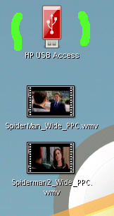
I blogged about this topic when I built my first proof of concept. I read the feedback and considered all options and have decided that my original plan seems the most robust, stable and feature rich. The HP thin clients run a Debian build, so I installed proftpd and got it working. The beauty of FTP is that it's stateless. Anyone that supports users of differing skills knows they will find ways to disrupt the best laid technology plans. :) I therefore did not want any stateful mounts from the servers to the thin clients. With the various techniques used by people, I know they would find a way to cause a problem with a mount or get something locked/stuck. FTP performs a task (list, upload, download) and then is immediately finished. Very clean, to me. I added a permissions based icon to the desktop:
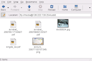
When launched, the script gets the hostname of the thin client currently connected and then opens a nautilus window. The FTP account on the thin client has a password that is entered via the dialog window.
SDISPLAY=` echo $DISPLAY | awk -F ":" ' {print $1}'`
nautilus ftp://media@$SDISPLAY
From the users perspective they don't think about the technology, and simply get a file manager as expected. The files can be moved to the server or desktop as desired. Files on USB sticks at remote sites will upload and move right to the servers located here at City Hall.
Here are the lines in proftpd.conf of interest in this deployment:
ScoreboardFile /etc/proftpd.scoreboard # file system allows writes
DefaultRoot /media # FTP can only get to media only
MaxInstances 100 #Lots of quick UI clicking counts as new users, increased
HideFiles (\.bas|\.bat|\.cab|\.cmd|\.com|\.dll|\.exe|\.inf|\.js|\.mdb|\.msi|\.vb|\.vbe)
IgnoreHidden on
The last section hides most executables from view completely. If they are on the users USB stick, GNOME won't even see or display them. If you can't see them, you can't drop and drag them.
I'm sure there will be some tuning, but it's working well enough for a pre-release.
We are testing some perks of this design:
- Being able to share your USB stick with other users, from any facility.
- Someone in our support group might be at a remote site fixing something, and they need a utility or program here at City Hall. Staff can push it right to them.
Fun stuff, it will be interesting to see how it goes.
Wednesday, February 20, 2008
Misconception About Server Performance
One of the biggest misconceptions about running software on servers is that it will be slower than having a local personal computer. My experience is that for the most part, the reverse is true when you buy hardware big enough to run your highest concurrent loads. That server will end up being of much higher quality and have better performance than any desktop computer or laptop you will purchase. This is especially true as desktop hardware moves through a normal 3-4 year duty cycle.
Following that line of thought, our 5 year old OpenOffice server is moving into retirement and I'm testing the new one. It's a 4 processor, quad core 2.4Ghz HP rack mounted box with 16GB of memory. Using a stop watch I'm starting the swriter binary and getting cold starts around 2.69 seconds for the UI to fully display. The splash screen only displays for about 1 second. I think the users will be very pleased with this upgrade.
Thursday, February 14, 2008
GNOME Scaling Problem
In March we will be putting the new OpenSuse 10.2 server live to our thin clients, with support for 3D/Compiz.
Federico is always very cool about me bouncing off him the odd things we sometimes see when running hundreds of concurrent GNOME users on the same server. I found such an issue, and have come up with a work around. When you have around 30-40 people logged into one server, and push live a new .desktop file the whole computer gets very slow as all of the application-browsers are updated at one time. The presentation freezes for all users for about 4-5 seconds while everyone updates. The more people on the server, the worse it gets. In case anyone is interested in improving this situation, I have snapped a screenshot that shows it happening. In the gnome-terminal window I am just duping an icon to simulate a new program being added. In the "top" window, you can see the CPU hitting 90% and all of the application-browser processes appearing at once. This sample was done with about 50 people. When I put on a full load next month, it will be far worse. The work around is low tech; icons will be added only at night when no users are on. :)
I'll say it again, all of this technology is working extremely well. This one small issue is hardly a show stopper.
Firefox 3.0 Beta Testing
I have loaded Firefox 3.0 (Beta 3) on our production server for testing. I also am testing the newer version of Flash that was released in December. I will try and use 3.0 fulltime until it's released. That will allow me to test all features and see how the upgrade will be perceived; and how best to alert users of changes.
Here are the issues that I am seeing. Some of these might be "user technique" (me), so I will continue tinkering and learning.
- Flash still seems crash prone when viewing videos. The PULSEAUDIO voice sync seems better on the December release. I'll continue to test. I know this is unrelated to Firefox, but I keep hoping this will get better.
- The first thing that I always do in Firefox is add a "Home" button on the top toolbar. But it appears to be gone in this build. I see it's available on the bookmarks toolbar, which I always immediately turn off. Hopefully this is an oversight, and will return in later builds (shot below).
- My mms and rtsp settings which worked perfectly in 2.0 are not working. In the shot below you can see the about:config setting. It's supposed to call a script which opens gnome-mplayer. I'll keep testing this and see if I can figure out the problem. Standard out and error provide no spewage.
--- The dialog appears for rtsp feeds, but when you click [ OK ] nothing happens.
-- gtkprint. It seems not to find CUPS printers on OpenSuse 10.2 I know 10.3 is out, but there are still a lot of 10.2 users out there, including us. "Print to LPR" for 99% of regular users means nothing and from their perspective printing is broken. I need to poke around and see if I can figure out how to get gtkprint to find and list the CUPs printers. I believe someone told me this behaviour is based on how it was compiled.
Update: Canvas scrolling on 3.0 using remote display to thin clients and Compiz is at least 50% slower. The scrollbars are very slow, as is movement with the scroll wheel. Thanks to those that commented, still tinkering here.
Thursday, February 07, 2008
OpenOffice And Understanding User Work Flow
One of the things that I am tasked with this year is improving relations between OpenOffice and our users. From a technical perspective it works well, is extremely stable, easy to support and upgrade and performs all of features required for 99% of work here at the City. My goal is to fill in the gaps between this technical view, and the technique/skills of users.
We are going to have some meetings in March to identify areas of improvement, and then explore using bounties to expedite some features. A bounty will be a onetime cost that hopefully can be merged into the main distribution for everyone to use.
The hardest part in obtaining information from users is separating "feature" from "specific product". My task today was to review the functionality of Publisher 2007, because it's an often mentioned missing feature in our current work flow. From how it was described, I was expecting a super powerful layout package with advanced features. It's not that at all. I had to take off my IT/Geek/Computer hat and focus myself like a regular user. When I personally approach a document, my mind is on the substance and text. The presentation and polish is the easy part, and last 5% of my process. But in reviewing Publisher you can see that many people work exactly opposite. They need to see pictures and thumbnails, and see an empty template first. They then want to use pre-defined text boxes, and load in the text from other documents into a finished product.
So experimentally I am using the thumbnailer in Nautilus to allow them to work in this manner. Instead of opening OpenOffice and constructing, I'll show them the finished product via .ott (template) files which are easily edited. I do know that OpenOffice has the ability to load templates inside the product, but I found them to be too many clicks and too hidden from view. The finished presentation needs to be the first thing they see.
Below is a shot of my first templates in this regard. I quickly built some awards and made them available from the main-menu. In this design, Openoffice isn't even seen until they have chosen their desired template. It will be interesting to see how this is received.
Monday, January 28, 2008
Compiz In 3D
Many thanks for "wodor" for updating the anaglyph plugin to compile with the latest version of Compiz. While certainly one could not sit and work at their desk all day with this plugin enabled, it shows that the community is thinking outside the box. The current plugin requires the old style red/blue glasses but I made the recommendation today to see if it can be changed to work with the newer polarized style.
Keep up the good work guys. Not everything can be deployed, but I'm enjoying the ride.
(shot below)
Keep up the good work guys. Not everything can be deployed, but I'm enjoying the ride.
(shot below)
Friday, January 11, 2008
Largo Updates
Things have been busy for me in the new year, and I thought I would relay my current projects:
Evolution Debugging
I have been working with Sankar and Chen on improving Evolution on SLED 10 SP1. We have made some gains, but still have more work to reach my goal. I received -debug packages from Novell and we are now auto-generating crash dumps when users crash. The good news is that all of these patches should be landing in 2.21 as well and will help advance Evolution connectivity to GroupWise.
Kyle TX Visit
The City of Kyle TX did a site visit and sent us a really nice email message with their observations. I think that people in general have seen so little of the Linux desktop and Compiz that they are shocked when they see how far it's come in the last few years. We demonstrated license free authentication, desktop presentation, email, web surfing and groupware. We also demonstrated single click access to MS Windows applications. I'm very glad they took the time to visit and wish them the best of luck.
Testing NoMachine NX
We are evaluating NoMachine as a replacement for Metaframe For Unix. We use Citrix for our distant remote sites that are connected over lower bandwidth lines. We have always had to keep a Sparc machine around just for this function. So far, NoMachine is running well and they seem to have some things on their possible road map that will be very useful to us; PulseAudio support and compositing for Compiz.
New OpenOffice Server
Our current OpenOffice still runs well and has been in production since 2003. However, it needs an operating system refresh in order to allow me to build the current PulseAudio. Pulse will allow the users to hear sounds in their Impress documents and anywhere else where sounds are present.
Weather-Wallpaper
This is completely bling, but the users love it. I have added weather-wallpaper to the desktop server. It automatically generates wallpaper based on the weather in the Largo Florida area. By default it requires users to enter the NOAA code for our area. Weather-wallpaper creates a directory called .weather-wallpaper which contains your personal settings. So all I did was get it working correctly and put a tarball of this directory into /u2/local/skel which is extracted for the users immediately before it's launched. This eliminates completely them having to do anything, and restores it back to a working state if they tinker. (shot below)
Subscribe to:
Posts (Atom)