I'm always fascinated with the support calls and UI questions that arise. Usually prior to deployment I get a feeling for places that are going to cause us problems, but sometimes I'm completely surprised by how others perceive software.
The one area that I knew would be troublesome is the GNOME keyring. That feeling proved itself true. We're using "mail-notification" which connects to Groupwise and sits in the notification area and alerts you of mail that has arrived. Works great and people love it. The launch scripts are fully ware of Groupwise and the IP and their user names and pre-fills it in for them. So all they need to do is enter their email passwords. The key ring opens, asks for the email password and then continues to the screen where it's requesting the keyring password. Users don't understand why it's asking for another password and then are annoyed by the keyring popping open each day. One can store the passwords in the default keyring, which is great...but the UI doesn't really tell you that fact. You have to NOT enter passwords; even though it's asking for passwords. You then have to accept a dialog indicating this storage to be unsafe. I fully understand what it's designed for, but we have found this whole process to be support intensive. I filed a bug report, and included a small mockup of an idea of how to make it easier in my view:

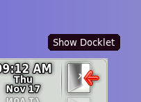
Some users are calling because they don't know how to lock the screen. The Quit docklet in Avant has this feature, but it's displayed in a secondary menu. This applet has been helpful to us because we have lots of users in 1024x768 so real estate is at a premium for them. A hover tooltip might help a bit, but unfortunately most users don't check nor use tooltips. I might just make a regular desktop icon and for those people with the space, they can pull it to their panel as a shortcut. This issue hasn't been too bad, only a few people called.

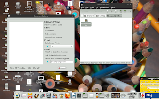
One of the more interesting issues is concerning calls we were getting about "Microsoft documents being empty and blank when opened". So we got the documents and they appeared to work fine with LibreOffice and OpenOffice. Further questioning found the issue: The gsf-thumbnailer is not able to create a thumbnail for Office documents as it can for OpenOffice files. So the users were double-clicking on them and seeing the preview window (below) and then seeing an empty page and never physically opening it in OpenOffice; because in their mind the document was empty. So what I'm going to do is change the code slightly so the default/blank panel will say something like, "No preview for this document, open to view contents".

It's great to continue advancing this project and be able to provide newer technology for our end users.
3 comments:
It's spelt "hardened".
On one LINUX distro, I had to install the "wv" package to get gsf-thumbnailer to thumbnail Word docs. Maybe that will help.
@anonymous: I saw the spelling error after I took the screenshot of the mockup. Haste makes waste I guess. :)
Post a Comment