- Many users never right-mouse click, ever. They do not understand contextual menus, and their workflow is 1, then 2, then 3. This is similar to old character based software. This doesn't seem to be based on age of employees, it's just how they think and work on computers.
- Most users have no idea about file types, file extensions, where things are saved, and what to name files. They want to click and tell the computer *what* they want to do, versus understanding the steps to make that happen.
- Users butcher file badly, and for instance save documents called David.odt and david.odt in the same directory, which often leads to problems for them later.
- Users do not use option menus well, and program names in applications like Evolution are of no use. GIMP does what? EOG does what? They know OpenOffice, but mostly they want to see words like "Edit", "Save" and "View" versus program names.
- Users do not understand applications like gnome-screenshot. That program has been ineffective because once the dialog comes up, they don't know what to do with the window. Sometimes they want to save it, but they don't know where the file is being saved. Sometimes they want to email it out immediately; but they don't know how to do that with the current UI. And it saves in PNG format, which people not on Linux sometimes cannot open.
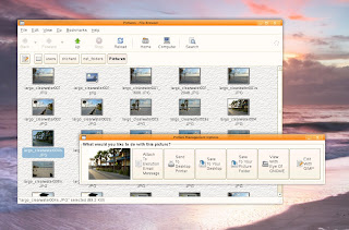
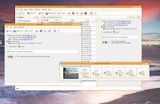
So what I am testing, (with positive feedback from our beta group) is MIME application tile bars that I wrote with python/Glade. The bars come up for Pictures, Documents, Acrobat, Video and Audio files with unique options for each. For instance the Picture Bar has replaced gnome-screenshot/PrintScrn, and also comes up when you double-click on photos in Nautilus and when you receive pictures in Evolution. A consistent interface is provided in all interactions with pictures. The tiles then tell them exactly what will happen to the picture, without further skills.
I know this makes advanced users cringe, but I haven't removed their ability to manaually save files and move them around. At the most, it's one more click for them.
Here are shots of what I am testing.
[ Bar launches when you double-click on photo from Nautilus ]
[ When attaching to Evolution, all formats are converted to .JPG. They can still manually drop-drag from nautilus if their skills are more advanced and they understand file formats ]

[ Same bar launches from Evolution on picture attachments]

[ Same bar comes up as drop in replacement for gnome-screenshot ]

[ Documents bar, opens when double-click on OOo and MS Office files ]

22 comments:
Congratulations: You've reinvented the action based side bar of the Windows XP explorer. As I agree that all the applications capable to handle a file should be accessable without opening a context menu: What about finally revitalizing the information pane of Nautilus' sidebar, merging it with the notes pane and integrating your mime type experiment? Mockup follows, when I am back from the mall.
Indeed the idea of putting this in a side is a good idea, as it is not terribly intrusive (maybe see how to build a nice UI using tracker integration to add data on the file). At least if you keep it like this make it usable from the keyboard.
I like the idea of the sidebar with tracker integration, to add or remove tags.
Dave, you are a freaking genius. This is such a good idea.
All I can say is, this is great for new users but there still needs to be a way for us more advanced users to open the default app with a single click and also have our right click menu.
Uses this as an option but don't take away options for advanced users.
The the promised but raw mockup: http://taschenorakel.de/mathias/tmp/nautilus-mockup.png
make it an option- If you want on by default- I can understand how it maybe helpful for the clueless, but adding a click, and a further mouse navigation through a window is very bad for productivity.
Is there some way to avoid the poppup window?
This is an awesome idea.
If you keep the separate window, an idea would be a pie menu. (http://en.wikipedia.org/wiki/Pie_menu)
It doesn't have to be exactly round, you could place the thumbnail in the middle with 8 square buttons around it. What would be good is designating a direction of the pie menu to a basic action. i.e. up = edit, down = save, right = view, left = send. If there are two applications installed to editing the document there will be two buttons in the upper quadrant.
http://img130.imageshack.us/img130/1696/mockuptw3.png
Comments always appreciated, I'm trying to come up with ideas to solve problems. I agree, that for power users the extra click is not pretty. But, in 700 people using computers here probably 650+ of them do need help with something like this bar. I think we represent 'business/enterprise users'. I'm also doing a lot of stuff behind the scenes unmentioned in my blog. I'm checking the mime type to ensure that they have the right file extension...and also picking a file name for them based on a date and time stamp.
Mathias, way cool mockup. I think the tile system should be moved into a library so that programs like Evolution could display them at the bottom of the preview pane. They would almost need to be squares, so that they could be stacked up and down or left and right based on the program making the call.
Dave, Mathias: way cool!
Users ... only as stupid as you force them to be. And you Dave are pushing really hard!
Why put it inside Nautilus? Why not make it a panel applet and put it on a side panel? Then we let applications with focus push their interesting files to the applet.
In Government there is no 'pushing'. Things just don't get done, and you have 27 meetings about why Linux sux and why we need Windows instead. :) In the case of the later, all that would happen is the same employees would struggle with Microsoft products.
The amount of lost time by users trying to figure out technology is just shocking to me; and it seems like it won't change. People having computers at home has simply increased their skills in adding bookmarks in Firefox, that's it. :)
I think you should put it smaller and appearing in one of the edges of the screen, only with the icons.
Avoid -unnecessary- words.
Send as mail
Print
Send to Desktop
Send to Pictures
(these two above should has different icons)
View
Edit
That one extra click + mouse navigation is a real big performance hit, especially since the action is performed frequently. The sidebar would be faster for both novice users and expert users. Plus it would aid in discoverability of features. (you only need to select files to see what you can do. Multiple select could add function like "compress to zip" or the likes.
BTW what OS doesn't support png? (IE does, even XP's paint supports it)
A view thoughts:
- make it an option. Don't force me to see the world as you see it.
- let me define which mouse click- behaviour leads to openening your menu
- make it usable from the desktop. needing a nautilus window for it to work is just plain stupid.
- drop program names. the users your aiming at don't know the names of their email app anyway. but let me decide which apps will be used by the bar.
- I second the idea of the pie menu. the menu centered around the thing you manipulate, now thats how it should look
- I wish we would drop thumbnails for pdfs. you can't see a thing in them anyway
Good work! I like the idea :)
Created Bug 415684[1] for pushing this into GNOME.
1: http://bugzilla.gnome.org/show_bug.cgi?id=415684
David, this is a good idea, in principle, but the UI needs to be refined.
I like the idea of a sidebar, but with the sidebar already on the left, would there still be enough room for the file list itself?
Have you seen the work done by Neil Patel on integrating metadata in to Nautilus? Link: http://njpatel.blogspot.com/2007/02/nautilus-love.html
It's promising stuff and I imagine it wouldn't be too hard to add a row of MIME-specific buttons in to this metadata pane.
With respect to replacing the screenshot applet, does it really need replacing? It has a few minor quirks (like not asking or telling you where it's saving to) but the UI is very friendly. It's far better than screenshotting on Windows.
To be useful to me, gnome-screenshot needs to:
Save the file, easily
Print the file, easily
Attach the file to email, easily (Evolution in our case).
Those are the things that people do, and do often. I think the print screen feature is used often because the printing of software is not very mature and you can often get better 'views' on the screen than you can on the printer.
I don't have the expertise to write a major GNOME app. What I wrote is a very simple frontend and all of the code is actually in a ksh shell script.
I have been warming and like the idea best of a new side panel on the desktop itself. That way you could select files in Nautilus, Evolution and anything else and process them all with one click. When you work in a large organization, there are often hundreds of thousands of documents, with NFS mounts to massive and multiple drives.
I'm probably going to cleanup and deploy these floating bars for now and work with the community on our needs going into the future.
Yet another voting for putting this in a side pane. I'm not saying I'd like it, but I'm one of those people who know about the context menu. And it would be much more tolerable then a pop-up window!
Loving Mathias' side pane mockup...
http://taschenorakel.de/mathias/tmp/nautilus-mockup.png
Post a Comment