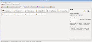
I took vacation days around Thanksgiving and am back in the office and once again working on projects. Over the last few weeks I have been poking at our support portal software end-of-day and adding a bit of code here and there. Yup, the theme is probably ugly ;) , but I'm trying to test various settings to see if any of them affect speed. In the past certain themes caused OpenOffice to perform more slowly, and I'm testing this concept against LibreOffice. Always nice for me though to see the old school mwm buttons.
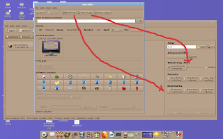
In the portal, the user detail screen now allows you to set the record as a bookmark and also the UI has been cleaned up for setting a watchdog to alert you when the user logs either on or off the network. Very often someone in IT will have an action item to fix something for the end user that requires them to be logged out. Now we don't have to watch them manually.
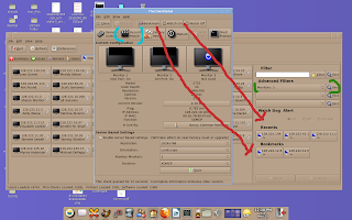
The thin client detail screen now has the ability to record a movie (cyan below) of the user session using the wonderful vnc2swf utility. We can see their session, it records a swf file at the same time. These files are easily opened in browsers and can be sent to vendors to show them multiple steps. Similar to the user detail screen, you can configure a watchdog item for when a thin client is powered on. You can also set a thin client as a bookmark. These simple little things save lots of times and lots of scribbled pieces of paper.
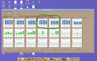
I'm revisiting the clunky UI of the charts generated on the server summary screen. Right now it's just creating an image with perl. Simple, but not elegant. Sure would be nice if we had some charts in GTK that had hover tooltips. Maybe some Googling will find something that works better. You can also see that our two GNOME servers are now running 80+ concurrent users (circled in green). Loads are great, and capacities will be increased as we go through the month of December. The concurrent loads of the various software packages can be seen below as well. CPU loads are excellent.
Groupwise 2012 was released for beta testing as part of a technology preview. I built a new SLES 11 server on some old physical hardware and got the pieces working. Probably all of the design considerations being discussed warrant an entire blog update; but we are reviewing the concept of just using a web interface instead of Evolution to gain access to Groupwise. In the past this was not an option because the UI was a bit clunky and major features (such as free/busy) were missing. GW 2012 has moved in the direction of having the web interface be your primary login. Seems like maybe the days of having a client piece for email might be nearing an end. The shot below shows 2012 running. GW detects an iPad/tablet login and presents and interface designed for that footprint. I should be able to begin testing that aspect in the coming days. So far it's much nicer than the older interface.
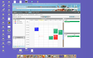
On deck for me: continued testing of GW 2012, more testing of Evolution patches we just received, increasing the number of users logged into the new GNOME servers, implementing some user suggestions to make the thin clients interact better with digital photos, iPad testing, MoinMoin 2.0 beta testing.
Tuesday, November 29, 2011
Thursday, November 17, 2011
New Desktop Progress Continues
We have been adding more groups of users to the new GNOME desktop and have gotten loads around 80 concurrent and besides a few bumps things have been going well. We are going to run in the 80-90 concurrent range for another few weeks and then add more people after Thanksgiving.
I'm always fascinated with the support calls and UI questions that arise. Usually prior to deployment I get a feeling for places that are going to cause us problems, but sometimes I'm completely surprised by how others perceive software.
The one area that I knew would be troublesome is the GNOME keyring. That feeling proved itself true. We're using "mail-notification" which connects to Groupwise and sits in the notification area and alerts you of mail that has arrived. Works great and people love it. The launch scripts are fully ware of Groupwise and the IP and their user names and pre-fills it in for them. So all they need to do is enter their email passwords. The key ring opens, asks for the email password and then continues to the screen where it's requesting the keyring password. Users don't understand why it's asking for another password and then are annoyed by the keyring popping open each day. One can store the passwords in the default keyring, which is great...but the UI doesn't really tell you that fact. You have to NOT enter passwords; even though it's asking for passwords. You then have to accept a dialog indicating this storage to be unsafe. I fully understand what it's designed for, but we have found this whole process to be support intensive. I filed a bug report, and included a small mockup of an idea of how to make it easier in my view:
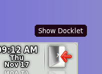
Some users are calling because they don't know how to lock the screen. The Quit docklet in Avant has this feature, but it's displayed in a secondary menu. This applet has been helpful to us because we have lots of users in 1024x768 so real estate is at a premium for them. A hover tooltip might help a bit, but unfortunately most users don't check nor use tooltips. I might just make a regular desktop icon and for those people with the space, they can pull it to their panel as a shortcut. This issue hasn't been too bad, only a few people called.
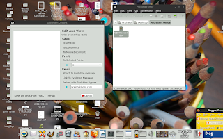
One of the more interesting issues is concerning calls we were getting about "Microsoft documents being empty and blank when opened". So we got the documents and they appeared to work fine with LibreOffice and OpenOffice. Further questioning found the issue: The gsf-thumbnailer is not able to create a thumbnail for Office documents as it can for OpenOffice files. So the users were double-clicking on them and seeing the preview window (below) and then seeing an empty page and never physically opening it in OpenOffice; because in their mind the document was empty. So what I'm going to do is change the code slightly so the default/blank panel will say something like, "No preview for this document, open to view contents".
It's great to continue advancing this project and be able to provide newer technology for our end users.
Thursday, November 10, 2011
Excellent Scaling Numbers
We have been slowly moving users to the new GNOME desktop and the results have been excellent. The server is a 4 processor, quad core HP and today we hit 75 concurrent users. CPU usage is under 1% and memory consumption is not bad at all. Unless we hit some as of yet unknown limitation, it looks like we could get a full load of 300 concurrent users pretty easily.
It's interesting that the highest amount of CPU is being chewed up the Citrix client (wfica) which seems to be very "talky". We are in the process of moving to 100% RDP as our connection technique to Windows, so in the coming months those will all go away.
Very promising start to the migration process.
Monday, November 07, 2011
Get It While It's Hot
Seemingly unannounced a new version of Adobe Reader was released in the last few days and it's here.
We have been very disappointed that that the last release was in February. I've seen countless exploit bulletins about this software in the last 9 months, but we'll take it.
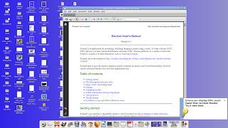
The shot below shows Adobe 9.4.6 along with a friendly reminder popup that users see alerting them that other software exists for reading PDFs. :)
Bi-annual disclaimer: Yup, I know that Evince does a great job with PDFs. However there are certain types of 3D content that can be inserted into a PDF that will not display in Evince; we therefore have to offer both software packages.
Friday, November 04, 2011
Desktop, Portal & NX 4
I haven't blogged in a while, but things here have been busy. The new GNOME desktop has passed all tests and with the 3.0 kernel on has been performing like a champ. We had a meeting and decided to begin deployment and will be going live starting next week. I modified our thin client builds to no longer allow users to connect to the older GNOME server and that will be the official cutoff once it's pushed with FOG. A few of our departments are already basically live on the new desktop, and next week we'll make it official. Over the next few months, we'll push over more and more people until the old server is no longer used. It's nice to see this project moving to completion. When we get heavier user loads running, I'll post information about performance.
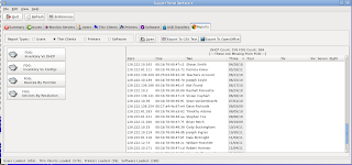
The back burner project of the support portal software continues. Now that we have our heads around the functionality we desire, I have been cleaning up the UI and making it more consistent with other software. The [Reports] tab (shot below) has been developed and is already saving us time. I have been trying to create reports that would take a LONG time to do manually. For instance, in the shot below the portal compares devices in the FOG server vs those devices configured to boot via DHCP. Through the years there have been device failures and sometimes the old entry is not removed. To manually check this on 500+ devices would take hours. It now happens in about a second. I have other reports in mind, and will continue advancing them a bit each week. UI needs work, but data is accurate.
I started revamping the UI and the results have been pleasing. The beauty of Glade is that these changes are cosmetic and very few coding changes were needed. Move widgets around, give them the same name and they just start working. In the [Users] tab (below), I moved all of the filters to the right side and cleaned up the results area. I started writing a new feature to alert us when users login or logoff the network. I also added the ability to see the last 3 people that you viewed in detail. You can now save users as a bookmark for later use. When going in and out of 800+ users, these features are wonderful. Lots of room for improvements, but making progress.
We received a new alpha build of NX 4 and I spent a few afternoons testing it fully and considering ways to get it deployed. The thin clients are all running the same universal build, so settings need to be configured to work in all types of logins and with rotating users and differing monitor resolutions. Making progress slowly and submitted to them a list of all issues that hinder deployment.
NX 4 still does not have a technique to deploy on iPads in the current build. It's coming, but not yet available. So we had an idea to get them up and running until we can deploy 100% NX. My coworker Brian set up a virtual Windows session to allow RDP connections from our tablets. The user profiles are then configured to automatically start NX and then connect to the GNOME server. This simulates how a native NX client would work, and at least will allow us to get some beta testers out there. In the shot below it's Ipad-->RDP-->Windows-->NX-->GNOME Desktop. Performance is good, and should get even better when the middle hop is removed.
Good days ahead for us as we move in lots of new technology, all of it as cost efficient and stable as possible. Happy Friday.
Subscribe to:
Posts (Atom)