I have always been a person that shows screenshots and mockups when blogging. I find that when I read other blogs and can't see a picture, I find myself wondering exactly what they are describing. From time to time I get comments about how the UI "sux" or that the artwork is "terrible". I wanted to make a few comments; I never take it personally, but what really helps me is to make your own mockups and post them for me to see. I'm not an expert, and sometimes people have made some excellent suggestions. The other bigger comment is that being a Government agency, if we had an artist doing all of our icons and if we spent hundreds of hours working on UI design - as a taxpayer that would be disturbing. If we had that many hours to work on software and art, I would consider us over staffed. I always try and reach a balance point where the UI works and is functional, and always try and use existing artwork that others have created.
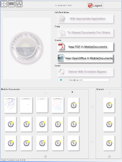
Ipad Portrait Portal Screen Finished
After meeting with some test users, they approved the initial screen and I have finished all of their changes (and it didn't take me 100s of hours :) ). The biggest change was that in the prototype the UI was blocked until all of the thumbnails were finished. Once they approved the design, I rewrote that code to not block the UI while the documents are being thumbnailed. In the shot below you can see that it finds all of the documents (in about 2 seconds) and displays the clock/busy symbol on the thumbnail and then fetches them while leaving the UI active. Previously 30 document so would take around 25 seconds to complete. Now the user can start working immediately.

Remote Logins with VNC and NX
I am still testing various remote connection software on the iPad and as I mentioned the VNC Software called Remoter is working very well for us. The developer has been very open to ideas and the response time over VNC is crisp and instant. When I touch the stylus pen to tablet running Xournal, the pens and markers are as fast as a local computer and very fluid. The next step is to work with our networking and security guys and get this working from the outside so that performance can be tested over EVDO and Internet connections.
Concurrently, the Nomachine guys have released their next alpha release of NX which finally supports iPads. The software continues to have an excellent design and installs easily, but the iPad and browser performance still suffer in comparison to using a native client. My testing indicated about half the speed of VNC. While promising and interesting, right now it's not something that could be deployed. Hopefully performance will improve during the beta and release candidate stage. We certainly have no objections to a native client for iPad if it's faster; even though it would require installing additional software.
Ipad Landscape Login
The Xsession file is configured so that if you log in in portrait mode the above UI is used, but if you log in in landscape mode the server thinks you are just a regular 1024x768 device and gives you a full desktop. There is a bug in shinyswitcher in avant-window-navigator that causes it to crash when using VNC/NX and they guys on #awn are cooking a patch. Response time is excellent over VNC and it's a very usable roaming desktop with plenty of real estate. Around 50% of our LCD monitors are still 1024x768 so this resolution is still fully tested and QA'd and it's working great on the tablet. I'm pondering some ideas right now in allowing users to grab control of their already running desktop from the tablet. That should prove interesting.
Servers Are Offline
In this case, that's good news. The old NFS server and browser/Firefox3 server have been powered off after running as an emergency backup server for 1-2 months. No problems with all of the new 64bit servers and things are running very well.
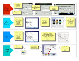
New GNOME Desktop Deployment
It's always a challenge to consider how much information to give users when you deploy new software. Most don't read what you send them, no matter how carefully crafted. I have noticed that when sending email they will read a bulleted message with very short explanations versus long paragraphs. I also have found that boxed, quick concise snippets of information will catch their eye. So with that said, the document below is the current handout that is being readied for the upgrade.


5 comments:
Good UI design can save you money when users get things done faster and with fewer support requests.
@Michael: I understand and agree 100%. I hope to always reach that plateau. What I'm talking about is where you excessively spend time with artwork, fonts, drop shadows, anti-aliasing, pixel counts around widgets. At a certain point the technology needs to get out to users.
I would remove the shadows on the lines. They're just confusing. And did you just tell everyone the default password?
I love following your work. It's nice to see that things can be well planned and organised and effective and include GNOME :D
Good luck with the future.
"being a Government agency, if we had an artist doing all of our icons and if we spent hundreds of hours working on UI design - as a taxpayer that would be disturbing"
Really? I'd be a lot more disturbed if the people I'm paying to run the country don't have the best, most usable tools possible to help them. This is the sort of argument that leads to most big companies (let alone Government agencies) having some of the crappiest internal tools I've ever used, which has a huge impact on productivity and effectiveness.
Post a Comment