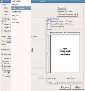
This widget problem has been around forever, and falls under "GNOME Polish". For years now many applications have had option menus with white space that fills the entire screen and forces the users to scroll up in a very un-natural way. These little things irritate 'regular users'.
[Shot taken from Acrobat, many other apps do the same thing]


No comments:
Post a Comment