I'm putting my comments inline with the items listed on the development ideas page. Some of the changes are going to make things harder for us (and very possibly other enterprise users).
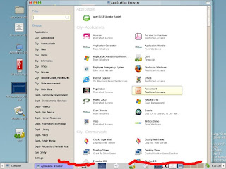
To start with, there is how our main-menu looks with all of our software loaded. We have a lot of departments each with their own software packages. I'm positive this is way more applications than is being tested; but very probably is the amount that most bigger deployments will use.

In 1024x768 users are unable to get to the window manager handles on the bottom (marked in Red). The "Groups" have no scroll bar code; so it doesn't know what to do when you have so many software packages that it doesn't fit on the physical screen.
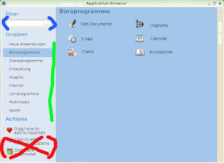
Here is the mockup that I found for the new main-menu:

I've marked in colors some areas of note:
(Red): I love the "Actions" section, however please allow me to remove the last 2 entries for the users. "Actions" and "Drag here to add to Favorites" should be aligned to the bottom and move down as entries are removed.
(Green): Scroll bars, please that activate only when you have enough "Groups". That total number will change as people move between resolutions. We have people that are logged into 1024x768 one day and then 1680x1050 the next. We also have mobile users logging in at 800x600 from their cars. When they come into the building they mostly use 1024x768.
(Blue): Filter. One interesting thing that I have noticed is that the users use the Filter to try and search for "Groups" along with applications. This currently does not work. Right or wrong, they do it often as I look over their shoulder. One of my groups is "City - Skills Improvement" and possibly if you type in "Skills" or "Improvement" it should return all of the software contained in that Group.
So my comments now on the developers Wiki. The developer items are preceded with a carot.
> The main menu opens a second window to allow the user to launch applications not contained in the main menu.
I kind of like the second window. What I have found is that users are intimidated by lots of things on the screen. The work flow that I have seen is that they only go into the "Big Menu" a few times when they first log into the desktop. They place shortcuts on the gnome-panel, wallpaper(Desktop) or into Favorites and rarely go back into it. There are literally hundreds of software packages that they rarely or never use. It would be nice to allow a gconf setting determine whether you get a second window or not. I would use it.
> It's slow
Even with 100 people on, mine opens in 2-3 seconds even with this many software icons. What is really SLOW is when you add a .desktop file with 100 people logged into the same machine. The whole server comes to a crawl while all 100 people refresh their cache. Bug is filed here.
> It's not what the user expects
It's been well received by everyone that has seen it. It's much better than old style cascading menus. 99% of people have figured out to do [ Computer ] >> [ More Applications ] on their own. I don't think this is a weak area of design.
> People don't use the category-links or search-filter on the application-browser's left side, thus scroll a lot to find an application
True. Many people try and scroll through the list of software applications. The one bad thing that I saw in the mockup is that if the user fails to understand that clicking on different "Groups" shows more software applications they won't see that more exist. At least with the current design a scroll bar immediately shows you that many more software options can be found below. Not everyone understands the concepts of tabbed choices.
> People don't use right-click in the application-browser, so they never discover that they can add applications to their favorites, nor do they know that they can uninstall applications from within the application-browser
Very true. Right-mouse clicks should always be one method to do something in software, but not the only way. Many users *never* try the right mouse click. It should also be noted that some users log into GNOME via NX/Citrix from Macs which have sometimes only a single button mouse.
> Make richness of application-browser more obvious by use of icons/text ('Drag here to add to favorites')
Yes!. This will compliment the right-mouse method.
> Force users to find their applications faster by using tabs for categories and icons for sublevel-categories
See comments above. By hiding the scroll bar, some people will not understand that the tabs produce more options. Remember, that technology is used by people of various skills. We also have a lot of users that only log on for email and leave request entry for 10 minutes in the morning before starting their regular duties. Not all employees work on computers 8 hours of the day to tinker and try things.
It's always nice to see projects moving ahead. Hopefully my comments have given some food for thought.

