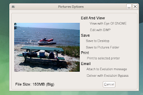
Yesterday when I posted the MIME bar prototype, I was given some ideas to make the dialog easier to use and fit better into current UI designs. I was mostly thinking about the desktop flow, but UI ideas are always welcomed. I whipped up a new version in Glade and connected the signals to the existing code and it's already working. It's not something that I could release because it's hard coded for our software packages, but might be a good idea for a GNOME project in the future. I guess in theory some more X-Categories could be added so it knows where to place these items. I'll be creating similar ones now for word processing files and for Pictures.
Shot below, I like that it has a similar appearance to the main-menu.

Update: A quick dupe of the screen and change of the thumbnails and the Picture and Audio/Video dialogs are starting to work. Thanks again Kevin for the awesome 'nailer' program for the videos.


yes this is much better, but place a respective icon next to headings edit, save, print and email.
ReplyDeleteYes, that does look a lot better - the tabbed interface in your previous screenshots looked rather clunky.
ReplyDeleteOne other suggestion though - the nested panel within the window seems to serve no purpose, adding only an ugly inner-border around the window decorations. I'd suggest dropping it - the window border is all the border you need...
Dave, could you give some details of what "Deliver with Evolution Bypass" is? I haven't read anything in your blog about it: some kind of internal direct email send?
ReplyDeleteMuch much better. I love the "(Big)", it would be usefull for some people I know... :)
ReplyDeleteTime needed for dowloading this file is still missing, and is a valuable piece of information that anyone would understand.
ReplyDeleteAwesome!
ReplyDeleteI would like what kind of printers and processors will be supported for the audio & video category... Can it turn music into notes and can it calculate the number of sheets to print that blockbuster at 24 pics/sec?
SCNR :)
@anonymous: I'm sure that the UI will be changed as I have time and improved.
ReplyDelete@jorge: Evolution Bypass is a simple SMTP bypass. The users get a prompt to enter email addresses and it goes right through the post office (Groupwise). The reason for this is because people have 25-50MB quotas and sending out big files will get them to their limit quickly. Very often, they don't need to have a copy of the sent file in their SentItems folder. So this works well.
fabrix: Now I need to decided what is small, media and big. :) Minor details that will be tuned.
anonymous: I'm pondering the whole download time thing. We still have people that use dialup in our City, and internet speeds vary...so I'm sure if I could estimate download times. Everything internal is lightning fast and running at 1Gb, which masks the true sizes of the files to our users.
@anonymous: Actually, I'm considering having the print option from a video file just print a larger copy of the still frame as seen in the picture. People LOVE paper and printing and love to take paper for writing to their meetings. I also might see if we can change the nailer application to allow me to specify the frame number. Maybe I could snap a bunch of frames and make some kind of spiffy print out.
hello, this project looks really good. I wish you good luck with it.
ReplyDeleteyou know the left side-panel nautilus has (that has the combo box with places, information, tree, history, notes and emblems options). maybe you could substitute the current "information" variant with this. I think that would be a great idea!
And than tweak nautilus, so that it would show this new "Information panel" only when some file(s)/directy(ies) is selected (the default panel could be "Places").
I'd suggest some white space between the thumbnail on the left and the actions on the right, and second the suggestion to drop the inner border.
ReplyDeletehow about defining a standard action for each filetype, mark it in the list on the right as standard action, and make a double click on the preview area launch that action? would make life quicker in a alot of situations
ReplyDeleteMuch better. Now to tear it apart:
ReplyDelete* remove the extra panel, add some spacing between thumbnail and actions
* for video you could look into making something like Media Player Classic does for thumbnails
* The default action is not obvious
* The fact that the actions are clickable is not obvious (but if you make it obvious, you are back to 'too many control elements' problem)
* Cancel button is useless - there is an element to close the dialog already - the X on the top.
* Does it resize down well? Netbook screens are often 600px high.
* Does it block while getting the thumbnail? It can take several seconds on a busy disk to get a thumbnail.